Lizard Wallet
Posted by Craftip (Sep 4, 2015)
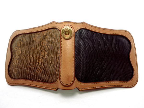
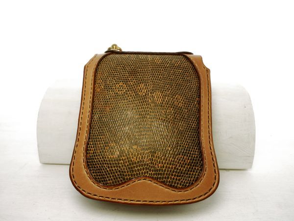
I used lizard leather for this wallet. I was particular about the thinness and usability. Using curves here and there is also one of the features.
This post is credited to 泰雅 安田.
See the original post in Japanese site.
-
1.
-
I challenged mayself to make an inlay of lizard. As to an inlay, I've had the impression that it would become very thick, but the thickness of this lizard leather part is about 1.6mm. Lizard leather is small and so I needed to use two sheets.
-
2.
-
Since I made the inlay part leather one-size smaller, the outermost edge has the thickness of only two sheets of leather.
-
3.
-
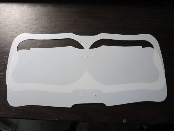
The leather of this part has the effect of keeping the original shape. Good appearance will change greatly whether you have this or not.
-
4.
-
You can use two of the lower type rather than the type of above when you cut the outermost of leather. The upper type is likely to deviate when tracing the pattern to leather.
-
5.
-
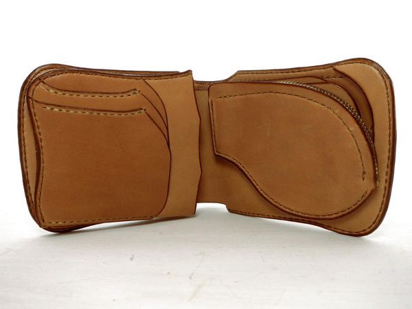
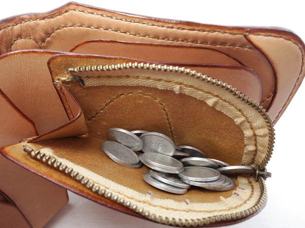
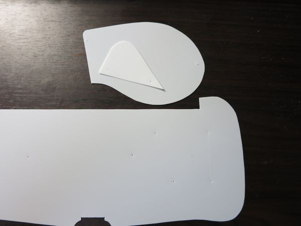
I arranged the coin purse on the right-hand side and the card pocket on the left side. Make both always 3 mm closer to the inside than the outer. That will change how easy it is when you put it in your pocket. It is a peculiar problem of this form, but because the seams of the coin purse may be caught on the card, the coin purse goes 3 mm inward.
-
6.
-
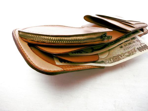
For the coin purse, to make it easy to take out the coins, I made the left and right of the depth both shallow when you open the zipper. As a result, I made it easy spread when being placed in the pocket, it has become a curved shape, which you cannot see in the work of other people.
-
7.
-
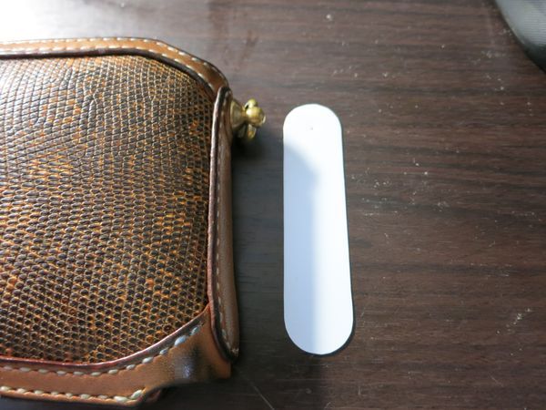
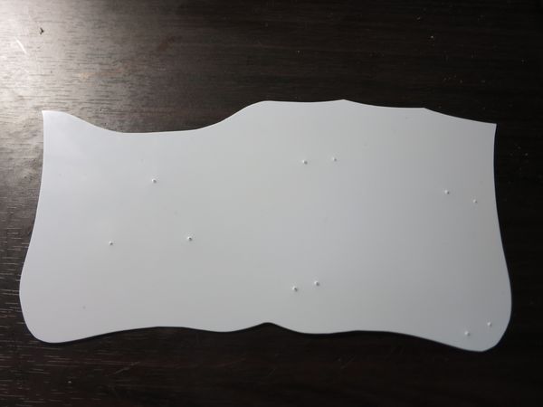
The way of sewing between the coin purse and wallet is the character of the "V". This way you can open the coin purse easily. I opened the hole for alignment in each part to prevent displacement. I did the same thing to the card pocket.
-
8.
-
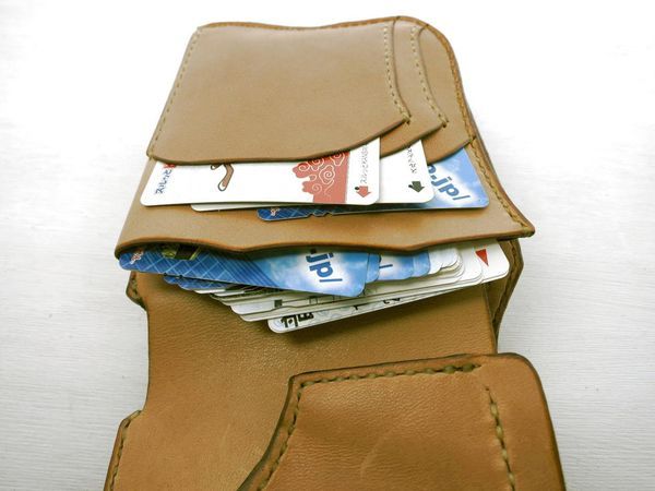
For the card pocket, I made the width of the back side seen in the picture smaller, and increased the width of the front side. That will make it easer to put in a pants pocket and to take out the cards. There is a card pocket you can stuck a lot of cards on the back of the wallet, but this is very convenient.
-
9.
-
As far as one part of the card pocket design, I made it the way you can fold the side. However, since the depth may need more than the width depending on the card, I'd like to make the design where you fold the far side next time.
-
10.
-
For a wallet part, because of the cut at both ends, this made it very easy to open. As for my personal opinion, it might be better if the cuts of the both sides were shorter, but people may have different opinions. Since it has a partition, you can use it for only particular bills, or receipts.
-
11.
-
Looking at this work briefly, you may think the creator put priority on the appearance, but I always give the priority to easiness to use and hardness to be broken. The reason for round shape rather than the form of the square is, I believe, that the corners are most easily become damaged.
-
12.
-
Priority of appearance is low, but I have stuck to it to some extent. I didn't draw a curve freehand in a halfhearted way, but used a metallic ratio. Metallic ratio is the ratio that makes it beautiful. Appearance will be bad if you do not use the metallic ratio.
Sign in to post a comment!




Show more